
This is the first instalment of a series of “systematic problems of placebranding projects” illustrating the roadblock faced by the brand Guadalajara. These essays are intended to help practitioners -both city officials and consultants- to launch more successful and resistant brands. (Read the subsequent ones here, here and here.)
Here we go again. Another city branding project is dealing with a public backlash. The Mexican city Guadalajara recently launched its new brand -with nothing but good intentions I assume. Sadly, what followed was a Category 5 hurricane of negative feedback. Does the brand Guadalajara really deserve to be criticized? Why did the public dislike the brand so much? Was there a way to avoid all this hoopla? And more importantly, going forward, what could be done to right the ship? Let’s find out.

Background information on brand Guadalajara
First, let’s bring everyone up to speed. Guadalajara is Mexico’s second-largest city. According to the city brand’s official page (I am mildly paraphrasing here), “Guadalajara needed a symbol that represents its identity, a brand to communicate to the inhabitants and visitors the promise of the future of the city. It needed to be known as a place where people live well and where it is easy to invest. The ultimate goal was to foster a sense of belonging and care for the city, to strengthen the identity of its inhabitants. The brand also needed to help to position the city in the world, to promote it as an attractive destination for tourism and investment.”
Guadalajara needed a symbol that represents its identity, a brand to communicate to the inhabitants and visitors the promise of the future of the city.
Based on the publicly available information, the design process was managed pro-bono by “local talents.” It is said that not a single peso was paid for the project!

The new brand is based on Pepe Guízar’s famous mariachi song, “Guadalajara, Guadalajara.” Also sung by Elvis Presley, the iconic song is arguably the best-known asset of the city around the world. It is thought to serve as a perfect example to convey the essence and cultural identity of the city. Experts claim that the moment they saw the logo, they immediately sang the song in their head, which is proof that the idea works as a visual trigger.
To sum up, Guadalajara launched a logo based on one of its iconic values, which triggers memories around the world like a charm. Moreover, the project did not cost a peso to taxpayers! Sounds like music to your ears, right?
Guadalajara launched a logo based on one of its iconic values, which triggers memories around the world like a charm. Moreover, the project did not cost a peso to taxpayers! Sounds like music to your ears, right?
The reaction
Well, unfortunately for Guadalajara, none of the above arguments seemed to work. The public discontent is visible and widespread. Some commentators claimed that “The brand was another example produced by a government, which does not care for good work.” Others hinted the possibility of plagiarism by pointing out the similarity to Mario Eskenazi’s Arts Santa Monica identity. Some even claimed that the logo could be created on Powerpoint in less than a minute!
My position in this debate is that all of the above criticisms -as objective, right and honest as they might be- are actually not the real reasons why this project has become a lightning rod. As someone who took part in multiple place branding projects, I believe Guadalajara’s efforts suffer from seven systematic problems of place branding projects, and none of those are design-related. These are:
- Misconceptions about what a brand actually is
- Failure to communicate objectives
- Failure to sell the problem
- Focusing on the wrong feedback
- Conflicting vision and actions
- Overlooking the change management leg of the project
- Lack of clarity over ownership
So let’s leave the design discussion to subject-matter experts and dive deep into the process-related issues of this project. This article is the first installation of a four-piece series.
Problem #1: Misconceptions about what a brand actually is
Based on my observations, many place branding projects get off to a poor start mainly because the project team fails to educate the public about the proper meaning of a brand. Looking from afar, it seems like the officials of Guadalajara might have fallen into this trap too. So what is a brand?
Let’s start with etymology. The word brand comes from brandr in Old Norse -a historical Scandinavian language- meaning fire. So etymologically speaking, a brand is not a logo, it is fire!
![]()
Following the same logic, branding means marking permanently with a hot iron. Back in the day, stockbreeders used to do that to mark the ownership of their livestock. The sense of the property can be traced in other languages too. For instance, Dutch merk and German Mark both mean boundary, boundary land (Brand is known as marque, marca, marke in prominent European languages.)

So, a brand makes something visible while branding makes its story known and understood by others. Over time the meaning of the word has evolved also to convey the notion of being trusted and liked. In a nutshell, today, when the officials of a place say that they want to be a brand, they basically mean that they yearn to be better known, better understood, more trusted, and liked by more people.
When the officials of a place say that they want to be a brand, they basically mean that they yearn to be better known, better understood, more trusted, and liked by more people.
So far so good for Guadalajara, for that’s exactly what the city aims to achieve. But the story does not end there. Guadalajara’s project team might have made a crucial mistake by not differentiating brand identity from brand image.
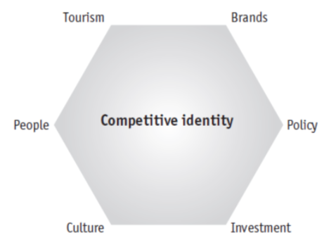
According to Simon Anholt, brand identity is what we see in front of us: a logo, a slogan, packaging, visuals, design. The identity of a city exists inside the place, and it is at least within the place’s own sphere of influence. That’s exactly what Guadalajara have created: a brand identity.
But what really matters is not brand identity but brand image. The brand image is the perception of the brand that exists in the mind of the public – it’s virtually the same thing as reputation. So cities have brands – in the sense that they have reputations. Unfortunately, brand image is notoriously difficult to change since it’s not located inside the place itself.

Decades of evidence shows that brand image cannot be shaped merely by creating a brand identity. The reputation of a place is a complex adaptive system that is formed by the amalgamation of the perceptions of its people, politicians, products, culture, economy and tourist attractions. Yes, visuals and promotional materials could contribute to changing a place’s brand image, but in reality, that impact is somewhat limited.
If I were an official of Guadalajara, before launching the city’s new logo, I would have issued a statement along these lines: “A brand is not a logo, and this is certainly not a design project. Changing the image of Guadalajara is a long and tedious process. This brand identity project is the first step. It might be a small step, but it is a step in the right direction nonetheless. We know full well that we cannot change people’s perceptions only by using visuals. That’s why more initiatives will follow in the upcoming months. Stay tuned.”
Cities have brands – in the sense that they have reputations.
Simon Anholt
Such an approach would have taken the attention effectively away from the visuals and shifted the focus to the real problem: The image of Guadalajara. Granted, whoever didn’t like the logo already, would have still disliked it. But nevertheless, the negativity would have been compartmentalized. Most people have an idea or two about what’s beautiful and aesthetically appealing. But few of those people would feel comfortable publicly criticizing a solid marketing strategy (provided that there was one.) Creating a distinction between brand identity and brand image is a simple tactic, but unfortunately, one that many destinations fail to deploy.
On the next article, we will talk about problem #2 & 3, which are the failure to communicate objectives and trying to sell the solution instead of the problem. Comment below and let me know what you think!
PS: Special thanks to Bunnyfriend for the links.
Excelente análisis del problema de branding en Guadalajara. Me parece muy interesante el punto sobre la diferencia entre identidad e imagen de marca. Definitivamente, las ciudades deben centrarse en construir su imagen y reputación a través de acciones sustanciales, no solo visuales. Espero con ansias la próxima entrega para entender mejor cómo se podría haber evitado este revuelo.
Gracias Daniel!